Canary's Frontier
Editorial: Thesis Project for BA, Nuova Accademia di Belli Arti
Grade: 110 with honors
Role: Editor-in-Chief, Head writer,
Photographer, Layout designer
Software used: PubCoder, Adobe Photoshop, Light room, illustrator, InDesign
Project Credit:
Giovanna Sala: Project Advisor
Federica Sala: Proof reader, Contributor
Ginan Padamsee: Contributor
Hashir Shadzad: Contributor
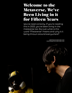
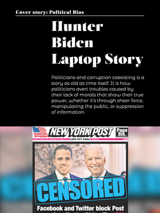
Canary's Frontier is a digital magazine project made for thesis project of NABA. I was responsible for the entirety of the project which includes writing articles, layouts design, optimisation for iPad& iPhone, and creating contents for range of topics including digital culture, identity, and social media censorship. All key photography visuals were made by me and all external visuals& assets are credited to respective creators. I've also brought a team of writers to curate Op-eds to match the theme of my magazine and have brought in exclusive interview for a US based Hiphop duo T H R O N E.
Cover Page
The magazine cover for Canary's Frontier was important as it was intended to set up the tone for the rest of the magazine. I created a character that acted as a mascot for the rest of the magazine, a man in a yellow hazmat suit and I created imagery of him navigating a blue toxic gas as a metaphor for the phrase "Canary in the coal mine". The cover is animated to take full advantage of Canary's Frontier being digital exclusive.

Logo design
Typeface:
Salome Fine


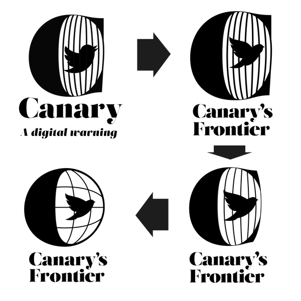
Ever since it's inception, one thing was very clear, that the magazine needed to have a logo that would instantly capture what the feeling of the magazine. I started with a strong foundation of bird in a cage idea and chose a stylistic serif font. Top left is my first conception with the Twitter bird as a place holder and I've build my way up. Each iteration, the design was changed for not only simplification but with the idea of application in mind.
I've made multiple attempts to make the previous logos fit with other magazine covers and it had failed to form harmony. The vertical line in the past cage design was creating a distraction on the eye, as well as the handle on the right end of the letter C in the space that it was occupying. So a new idea was came about to made the logo much rounder and simplify the cage. The finished product is much more balanced and feels harmonious with the bird inside the cage, and with its surroundings.
The Final logo is one that can be used separte from each other, creating a room for contents in the middle. The bird cage and the text won't be together most of the time, but I do think that the text logo by itself is a little blend, and the birdcage has a lot of potential to add character to the overall image when applied moderatety.

Typeface
& The look
Typeface used:
Salome Fine
Montserrat Regular
Montserrat-Alternates
Salome is an elegant custome font by Atipo Foundry. It is perfect for editorial headlines and it gets the message across with boldness but with a bit of grace. It's got very thin arcs which contrasts heavily with the thick strokes across all letters. Believe it or not, these two fonts on the bottom is a part of the same Montserrat family; one on top being the Monserrat alternates and the other being the regular. Montserrat regular's got a very stable and thin profile while the alternates retains some of it but is very heavility invested in style. It makes subheadeings stand out just as much as the heading and when paired with Salome-fine, it creates very interesting contrast that synergizes well with the visual elements as well.


Layout
The Layout is optimized for tablet and designed to scroll vertically. With that in mind, the text margin is divided in 7:3 ratio within the inner grid, and some margin outside of it. The aim was to give text and content some room to breath and have a sense of harmony. I tried not to have too many pictures in one single plain as much as possible, meaning there's almost always just one picture within a single row, maximum 2. Because Tablet has much smaller real-estate to work with compared to a regular magazine or a desk-top website, I had to carefully arrange the contents. Each page has an initial animation followed by interact-able elements, taking advantage of the touch screen interface. I tried each interaction as meaningful and minimum as possible to draw attention, but to not take away too much from the article.


